

What are Brand Guidelines?
Brand Guidelines are a set of rules that help communicate your brand to the world. These guidelines will help directors, leaders, and volunteers present the brand with consistency through design elements, such as fonts, colours, graphics, and tone.
The WYN brand and website were created by our graphic designer volunteer (2021-2024). Check out her work on her portfolio or the WYN brand featured on her website!
Primary Logo
Primary logo is the first one you should use.
Use the logo in its original form. There should not be any alterations; this includes colour changes, distortions, skewing, filters/effects, or removal of elements. Present the logo in a professional and accessible manner.
Acceptions: On dark backgrounds, present the logo in white. On light backgrounds, present the logo in black.
Formatting the logo other than outlined is prohibited.

PRINT
Files such as EPS, Ai, and PDF are best suited for print. These files retain the logo’s high quality at any size. Use for large displays of the logo.
DIGITAL
Files such as JPEG and PNG (.jpg, .jpeg, .png) are lower quality and are best suited for smaller sizes for digital media (websites, digital documents, etc). SVGs are of the highest quality at all scales and should be used for web use.
Online vs. Print
Secondary Logos
The original logo should be used at all times unless there is spacing issues. If issues occur, consider using the horizontal logo or symbol.
Use the horizontal logo when you need to display the logo in condensed spaces.
Use the symbol to quickly communicate your brand.
Horizontal Logo: can use on letterheads or in condensed spaces.

Symbol: can use for favicon (website), social media icons, digital decoration, or anywhere the full logo cannot fit.
Alternate Logos
*Branch logos have been updated as of July 22nd, 2023
Branch logos should be used for the branch social media profile pictures.
Use the logo in its original form. There should not be any alterations; this includes colour changes, distortions, skewing, filters/effects, or removal of elements. Present the logo in a professional and accessible manner.
If your branch is missing a logo, please contact antonia@willowyouthnetwork.ca.


Colour Palette
The two shades of purples were brought from our original Indigo Girls Group branding. While it represents our past, purple also represent calmness, imagination, and creativity that participants experience during workshops, and our team’s knowledge and wisdom.
The WYN logo should only ever be reproduced in its chosen colours. If printing, use Pantone colours. For a lower print cost, use CMYK colours. For any digital use, use Hex codes or RGB colours.
#4D2A7C
C18% M32% Y0% K51%
R 77 G 42 B 124
Hex Code
CMYK
RGB
#AA81BA
C6% M22% Y0% K27%
R 171 G 131 B 187
#FFFCF9
C0% M1% Y2% K0%
R 255 G 242 B 249
#ebe7f3
C6% M8% Y0.05% K0%
R 235 G 231 B 243
Colour Contrast
It is important to have high contrast between the background and text. The left side shows effective contrasts, while the right shows ineffective, hard-to-read colour pairings.
Good colour Pairing
Bad colour Pairing
Font Use
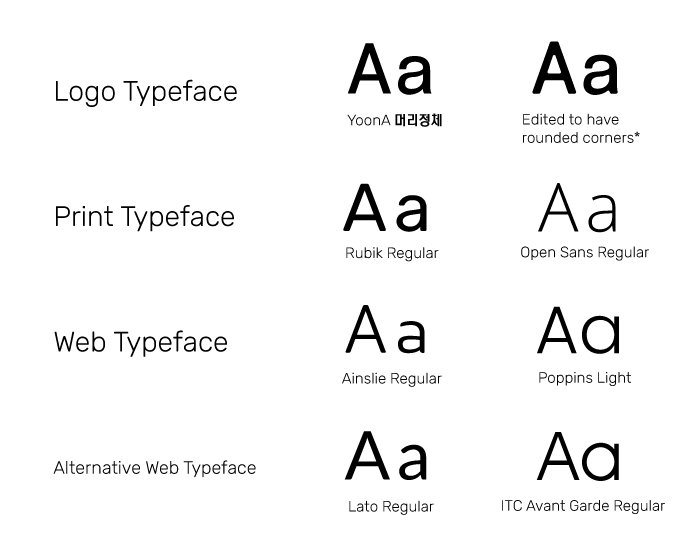
LOGO TYPEFACE
YoonA 머리정체 is a san-serif font which was edited to have round angles. The logo uses a bold variation on the words Willow and a medium variation on the words Youth Network. For branch logo, the branch name uses a light variation.
PRINT TYPEFACE
For print, use Rubik Regular for headings and Open Sans Regular for body text. Body text should be around 9-11pt and Subheaders should be 2-3 points higher than the body.
WEB TYPEFACE
For web, use Ainslie Sans for headings and Poppins for body text. If Ainslie is unavailable, use Lato in Regular or Medium text, and the body should be set in regular text. If Poppins isn’t available, use ITC Avant Garde Gothic Pro Book as an alternate.
SOCIAL MEDIA TYPEFACE
For social media, use Ainslie Sans for headings and Open Sans regular for body text. If Ainslie isn’t available, use Rubik Regular instead.
Digital Online Presence
Digital presence across all platforms should convey the same theme and colours. Using the elements below will maintain a unison and professional look for the brand.
Branches should post content about upcoming events/meetings, recruitments, workshop/event highlights, and volunteer testimonials.

Favicon

GRID PATTERN
Consider implementing an Instagram grid pattern. Grid patterns may include alternating brand colours or alternating between graphic posts and photos/videos.
Brand Assets & Patterns
These illustrations can be incorporated on social media posts or marketing materials to communicate our youthful and friendly tone. These assets are also available on our Team Canva (ask Director of Communications for access).
Brand patterns may never be used; however, they can be used in packaging, websites or letterhead banners, post/story backgrounds, business cards, etc.


Brand Applications
Note: These mock-ups were made before we made the switch to .ca (Fall 2023), so the examples below use .com instead of .ca
You can see the updated brand on the designer’s website.


